Thursday, November 19, 2015

Chuck Close - Sienna

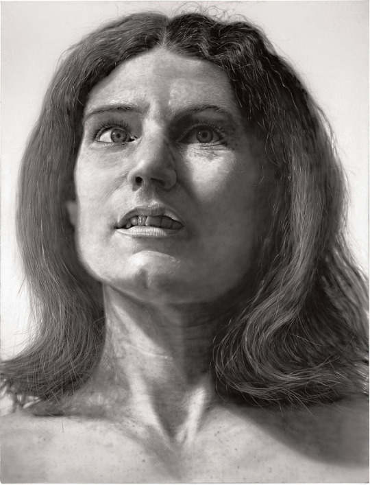
I really enjoyed this watercolor pigment print of this woman who i assume to be named Sienna since it is the name of the print. I chose this work of his because i was drawn in right away when I saw her hair. I thought it just had such a cool look to it, I felt as though this one stood out from all the others. I like how it looks like she is in a daze and not sitting straight up with bad posture. It seems very natural.

Nancy


I chose to use Nancy from 1968 as my selection of Chuck Close pieces because I thought that it showed the great detail and realism that he used in his art as a contrast to his more abstract works. I think that this may have been before his accident which would explain why it has a different style than his other more abstract works.

-Aimee 

Chuck Close - "Alex II" 1989

This was done with oil on canvas. I chose this one because it is zoomed in and you can see the colors individually on the right image, as opposed to the left image, where you do not see the colors as vibrantly. The left image looks more like the tones of a human but he still captures that richness in color. By looking at the two images together you can see that he used a grid as his method. At first I did not really like his style but then I read about some things that are motivations for him. I read that he has trouble remember faces, so capturing them in portraits is his way reinforcing the images into his memory. One reason I like art in general is because it is expressive and personal. Now that I undertsand the art work of Chuck Close I have begun to like it more.
 
http://www.artyfactory.com/art_appreciation/portraits/chuck_close.html

Chuck Close

"Untitled" (1990)

I was drawn to this specific self portrait because while Close remains consistent with the style of using a variety of tiny squares to create a full image he decided to use black and white effects opposed to his usual colored paintings. 

Chuck Close Self Portriat

I personally find this Chuck Close Piece interesting for a few reasons. One reason is that after seeing the process that he takes to create his self portraits I can appreciate the detail in the angle and perspective he chooses. Also I feel the structure of the shapes within the boxes is very interesting, and that is what brings his work together, in other words the shapes of the face come together to make expression.

chuck close self portrait 2007

I enjoyed this self portrait the most mainly because of how it is made of black and white hues. Each individual square is unique and abstract yet are able to come together to form a unique self image

Chuck Close


I chose this artwork of "Shirley" by Chuck Close. He used oil on canvas to create this portrait. I find it fascinating that this portrait is created by little pieces and it's all put together to make it look so realistic. From her glasses, to her earrings, eyes, and hair the way he put the tiles together so perfectly makes it easy to see the face of Shirley and portrays what she really looks like.

Chuck Close - Zhang Huan II

From a distance, everything looks perfect in a way that you really can see the technique, everything looks redefined and polished. When you get close to the painting, you see how loose and free everything looks. And at the same time, I think its almost like calligraphy of the Chinese tradition. Zhang Huan is a Chinese artist based in Shanghai and New York. He began his career as a painter and then transitioned to performance art before making his comeback to painting.

Chuck Close - Self Portait


I chose this piece by Chuck Close because I like the way he is able to create such life-like detail in his painting. Not only that, but Chuck Close paints one individual square at a time; treating it like it is its own work of art. To me, being able to create a realistic painting out of many small ones is a feat in itself. Finally, I like how he is able to use contrasting colors within his painting, and even within individual squares, to create a very unique color set within the painting.

Wednesday, November 18, 2015

Chuck Close: Kate

I chose this tapestry of Kate Moss because it shows so much detail for a tapestry made of over 17,800 threads made through digital weaving techniques. The shadows, strands of hair and freckles that are so easily seen make it look so realistic.

Chuck Close | President Bill Clinton

This was painted by Chuck Close using oil on canvas in 2006. I chose this portrait of Bill Clinton because it was of a famous face that I immediately recognized. I like the technique Close used for this painting in working smaller images into one giant image. From a distance, it's easy to see that this is a portrait of Bill Clinton, but up close, you can see each individual square image that make up the bigger image. I like that various abstract shapes and colors are used in each grid that ultimately blend together. They give the painting a sort of watery texture.

Chuck Close

I chose Lucas II , 1987. oil on canvas, because I found it really interesting how he made a portrait more than a portrait. The patterns of the colors he used almost create a sort of mandala effect and make the painting so much more interesting.

Chuck Close: Baby Self Portrait

This piece of art that Chuck has worked on is very creative and detailed. I find it very interesting because if you look closely, you can see that this portrait has small squares throughout it; making up the actual face of the child. In each square I enjoy how Chuck used different designs and color, and then when you step back all the little drawings in each square make up Chuck as a baby. I think this work of art is very different then others, and with that his work makes it more fun to experience and look it. I admire his ideas as an artist.

Chuck Close: Susan

I chose this 2011 work by Chuck Close because I find it so interesting that he achieved such an accurate representation of Susan while only using dots of color. He did this by using felt stamps to hand apply oil paints on a silkscreen ground. This is still a good example of his grid use, just slightly different because it is each particular dot made by the stamp. 

Tuesday, November 17, 2015

Chuck Close: Kate


I chose this portrait of Kate Moss by Chuck Close because of the detail he was able to achieve by using a weaving technique. Instead of painting this image, Close used an advanced digital weaving technique to create this tapestry. I think the weaving gave this image unbelievable depth and texture that would have been difficult to achieve with traditional techniques.

Big Self-Portrait (1968) - Chuck Close


I chose this painting by Chuck Close because the first time I looked at it I thought it was a photograph. Close was able to paint such little details in his self portrait with such accuracy that it practically looks like a photograph. He was able to show single strands of hair from the hair on his scalp, chest and mustache, as well as the stubble on his face. I also think it is neat that he was able to capture certain details such as the reflection of light on the lens of his glasses and the smoke coming from his cigarette.

Thursday, November 12, 2015

Amedeo Modigliani-Madame Pompadour

This is one of the most famous portraits created by Modigliani. The painting is of a woman named Beatrice Hastings, who had a love affair with the artist for over two years, and sat for many of his paintings. I thought this was a very interesting painting and a bit different from his other works.

Amedeo Modigliani

 
This is called woman with red hair. It was done in 1917 with oil paint. I really like his style of expressionism. The woman here looks really sad. I think he captured her emotions well, especially by having her hold a violin. I like the choice of colors and the angle this was painted.

Amedeo Modigliani


I chose this piece of work done by Amedeo Modigliani because it was simple, yet showed a mysterious expression. This is a picture of his wife Jeanne Hebuterne in a large black hat that showed her signature style. He used earth tones to create this picture and what I also like about it is that he elongated her face as well as her hands to make it more unique.

Amedeo Modigliani

Amedeo Modigliani's work, The little peasant, made in 1918, is one of his works that I personally enjoy. I especially like this work because of the texture of the clothing and face. I feel that really brings it to life and gives you the feel the artist is trying to depict. 

Amedeo Modigliani | Portrait of Pablo Picasso

This is one of the portraits painted by Amedeo Modigliani of Pablo Picasso. I like the lack of definition in Picasso's features and the overall neutral tone of the piece. Both Picasso and Modigliani seem to have been influenced by one another in their respective works, so it is interesting to see one artist using another influential artist as the subject of his piece. 


Amedeo Modigliani

Potrait of Maude Abrantes. This painting is considered one of Modiglianis earlier works and has more of a traditional look. This painting also depicts his later style of work in which he uses elongated neck and the still emotion on her face. What also is different from this work compared to his later works is there is more detail in her clothing. He preferred women as his subjects and many of them had love affairs with him.

Wednesday, November 11, 2015

Amedeo Modigliani- Portrait of Moise Kisling

I chose this painting by Amedeo Modigliani because I liked how it is clearly not to scale of a self portrait. The eyes are not leveled like some of his other paintings and the face is not proportional. I like this because in reality not every face is symmetrical or perfect, Amedeo showed this in most of his paintings and sculptures. 

Amedeo Modigliani: Alice

I chose this piece because it is a slight contrast from Modigliani's typical rendition of the female figure. Usually he paints women naked, but here, "Alice" is fully clothed. This made me wonder whether or not this model was someone he knew personally, as opposed to his typical choice of prostitute models. Maybe because he had a personal connection with this person, he chose not to paint them nude, as a sign of respect.

Amadeo Modigliani

I chose this piece by Amadeo Modigliani because it shows his true love for painting. I think its very important as an artist to know that when you are making different pieces that you should always tie in what you love with it because that's what gives the painting more meaning. The more meaning a painting has behind it, I feel will attract more people to want to see it and learn about it. I think it is very interesting how Modigliani blends his colors together creating the human body, and uses models to express his talent. although this picture is not a picture of this woman's full naked body, I feel it still has the capability of getting the point across that Modigliani has no shame painting the human body. He expresses in his work that anyone's body is beautiful no matter what color, size or age you are.

Cellist (1909) - Amadeo Modigliani

I like this painting by Amadeo Modigliani because the cello in particular has a lot of different shades in it to show the richness of the wood. Also, the choice of colors are so simple and dull, making the richness of the cello really stand out. I also think that it Modigliani captures the relaxing state of the cellist, as he seems to be very calm in his appearance.

Tuesday, November 10, 2015

Amedeo Modigliani: Equestrienne

I chose this painting by Amedeo Modigliani because the colors stood out to me. It reminds me a little bit of the charcoal drawing that I did with the dark black background and then a bright orange focal point which I think looks really nice and makes the piece stand out. I also love that you can see the brush strokes like in many of his paintings. Another things that I like about it is that it seems to be of a powerful women and that is shown well by the way she is standing.

Amedeo Modigliani

I chose 'Woman with Blue Eyes' because I thought it was interesting that most of the painting is neutral colors or dark colors which is opposite to the color expected to see in the title. The eyes of the woman in the painting aren't even extremely blue but they are the faintest blue. I think the subtlety is just enough to make them pop.

Madame Georges van Muyden - Amadeo Modigliani


I decided to use this painting by Modigliani for a number of reasons. First, like all of his works, I like his use of canvas space and his choice of colors; His style is identifiable, unique and elegant. I specifically like the way he drew this woman's figure. After doing some research, this was one of the first pieces he had done for commission in his career. Finally, I just appreciate the piece overall. Modigliani used the space well, used his colors well and put together a painting that was both realistic and portrayed his unique skill set.

Thursday, November 5, 2015

Jean-Michel Basquiat Untitled, 1982

I love this piece of work by Jean-Michel Basquiat. It is an acrylic, oil stick collage that makes up a face. I think this is such an interesting idea. It makes me think that everything inside the head is what is actually going on inside that persons head and is what they are thinking about.

Fishing

This piece called "Fishing" by Jean Michael Basquiat made in 1988 is very unique. I think the structures in the face are very interesting the way they are produced and the random lines and body structure is intruguing how it makes a complete composition.

Trumpet

"Trumpet" 1984
I was drawn to this painting because it resembles the love Basquiat had for Jazz. During all of his sessions he would listen to jazz music and collaborate it with his pieces. He also addresses sports, black identity and music in many of his pieces and in this one he recurs this theme by using jazz music which at the time was well associated with the urban community.

"Scull" Jean-Michel Basquiat

 I chose Jean-Michel Basquiats "scull" because I liked how there was so much going on in one picture but you can still figure out what it is. At the age of seven his mother gave him a copy of Gray's Anatomy, in which he used to create all of his unique work later on. I think this picture is neat because he uses his graffiti techniques with acrylic and crayon and drew all the bones in the skull. He even drew teeth and eyes which was different because it looks like the bones are coming through the face. I also like the colors he chose to use because they really stand out in the photograph.

Flexible (1984)

Flexible is one of Basquiats lesser known pieces of art. Created out of acrylic and oil paintstick on wood i feel that this piece of work is very unique. I like how abstract it is while still having familiar components like lungs. Although this seems very familiar i like how Basquiat left room for interpretation.

Jean-Michael Basquiat

This painting is called Boxer and was created in 1982. This painting depicts a black boxer in the foreground of a white graffiti filled backdrop. This painting was sold at a auction for $13.5 million in 2008. This painting was part of a private collection of Lars Ulrich, the drummer for the band Metallica, he sold this painting so he could build a house for his family.

Jean-Michel Basquiat | In Italian


This piece entitled "In Italian" was done in 1983 with acrylic and oil paint on canvas. I like the amount of color Basquiat uses in his works, especially this one. This piece also seems to have a lot of religious references. One of the main subjects of "In Italian" is a blue-headed figure that seems to be representative of Christ. He has the words "crown of thorns" written above him and the words "sangre" and "corpus" below him, which translate to "blood" and "body". I also find it interesting that Basquiat put two coins in this painting with the word "liberty" and the year 1951 on them. This could possibly  be a reference to the civil rights movement that started at this time in history.

Jean Michel Basquiat

All of Jean Basquiat's artwork is unique and creative and that is why I enjoy it so much. The history behind his name makes his artwork even more meaningful to look at. Every piece of work is different and I believe that each piece expresses a different part of his life. The reason I picked this one is because all the words that are written throughout it, are in some way important to him; and the fact that he calls it artwork and publicizes it for people shows the person he really was. Since he did live a hard life I feel that, he is one of the few people who literally went from a bum, living on the streets to following his heart and finding a career out of it and getting people to love him. What makes his art so beautiful is that it isn't like anyone else's; its not something you would expect to become so popular because it isn't the greatest art I have ever seen, but because he is the artist and says its art, its art.

Jean Michel Basquiat- Obnoxious Liberals

This was done in 1982 with crayon and acrylic on canvas. I really like the choice of colors -blue and red. Using white makes the painting seem patriotic. However, the man and the writing are in black which lets the viewer know that the artist is trying to send a message or express some dislike. I thought the painting was funny at first and then I realized a deeper, more meaningful message. It was huge in that time period for a younger person to be politically driven.

Wednesday, November 4, 2015

Jean-Michel Basquiat - Ascent


I chose to do the piece "Ascent" by Jean-Michel Basquiat. Basquiat created this piece in 1983 and I like it for a number of reasons. First, his color choice allows for contrast, depth and gives the piece personality. I also like the fact that it is an abstract work. Basquiat used a couple different techniques to create the piece and thats what makes it unique. Finally, I like how he created, then scribbled out a section of the work; whether it was done on purpose or done as an artistic way to cover up a mistake, I feel it helps make the piece stand out.

Jean-Michel Basquiat: Dustheads

This painting by Jean-Michel Basquiat is of two figures on PCP (the hallucinogenic drug) and was sold in New York for $48.8 million dollars. I chose this painting because of the use of color but also the controversy that surrounds it. Art critics argue that his work is not worth that much money and they have labeled him as a street artist even though today he is the most collected artist of sportsmen, actors, musicians, and entrepreneurs. 

Mecca - Jean-Michel Basquiat


I think The Mecca is a really cool painting by Basquiat. Basquiat painted his interpretation of New York City as the "Empire." I think it is really cool because of the simplicity. Many think of New York City as a crazy, fast-paced place, but this painting simplifies the city to be just tall skyscrapers. Since Basquiat is from Brooklyn, I think this painting interprets his own thoughts on New York City, as well as his lifestyle, as simple. From an outsiders point of view it may seem hectic, but in his own head, he may have just thought of it as home. In 2013, rapper Jay-Z purchased this painting for $4.5 million.

Jean-Michel Basquiat Untitled (Two Heads on Gold)

I chose this work by Jean Michel because I liked the colors he used. His other works are much louder and brighter with yellows and reds but I like the calmness of the coors used in the one even though the design is just as loud and wild as his other works. I also like how it almost looks like he changed the skin tone by switching the same color to one of the figures clothes. It is a political, and even  possibly controversial, piece that can be easily admired.

Jean-Michel Basquiat: Untitled (The Boxer)


Coming from a immigrant working class family, Basquiat was fond of the portrayal of the boxer. A boxer represents dogged determination, something he embodied as he fought through the adversity of racism and socioeconomic setbacks. He admired Joe Louis and Muhammad Ali for their resilience, and I chose this piece because I feel it captures the fight he attempted to portray.

Tuesday, November 3, 2015

Jean Michel Basquiat


I chose this print by Jean Michel Basquiat called Charles the First, 1982 because I love the text he chose to use as the focus: "Most young kings get their head cut off". I think this text is important and interesting because Basquiat wanted to be famous; he wanted to be king. He saw Andy Warhol as the top of the art scene at the time and he dove right in the mix in order to be at the top as well. I think it is interesting that he chose to say that young kings get their head cut off because he was young at the time. I think it is interesting that he did pass away at a young age after rising to the top and gaining fame, almost like he was king, who at the hand of drugs, met death; much like getting his head cut off.